Sellin — E-commerce Analytics SaaS Dashboard

This case study explores the design process behind Sellin, an E-commerce analytics SaaS dashboard focused on revenue tracking, order volume, SKU performance, inventory levels, and category insights. The work centers on UX structure, UI design, research-driven prototyping, and a component system built for scalable retail data.

Author Image
Taras MIgulko
Art Director
calender-image
November 28, 2025
clock-image
20 min read
Blog Hero  Image

1. Platform Context

Sellin is an E-commerce analytics SaaS dashboard built to structure sales data, product performance, SKU behavior, inventory levels, and category insights into a clear analytical system. The platform consolidates metrics that usually appear scattered across separate tools and arranges them in a stable UX hierarchy. The dashboard begins with revenue, orders, average value, and customer count. Below that, users can review timeline-based sales patterns, category-level activity, product lists, SKU data, and stock information.

The UI design supports dense commercial datasets and the fast pace of retail environments. As product catalogs grow or order volumes increase, Sellin maintains consistent readability. The goal was to create a data-first environment where KPIs, charts, and tables form a coherent structure rather than competing for attention. Every UI element—cards, grids, tables, lists, and forms—was designed to present quantitative information without unnecessary visual noise. Sellin’s layout provides a dependable starting point for understanding store performance across channels, categories, and time periods.

Blog Image

2. Research Foundation and Analytical Structure

The research phase included an extensive review of E-commerce SaaS dashboards, retail ERPs, sales tracking tools, and product management systems. A recurring pattern emerged: many interfaces display data in fragmented ways, forcing users to move between separate screens to assemble a complete overview. Metrics were often presented without context, making it difficult to compare categories, understand SKU behavior, or track changes in sales dynamics.

Based on these observations, a prototype was developed to test a logical analytical progression. The prototype confirmed that retail users interpret data most effectively when it follows a consistent sequence. Revenue and order-level trends appear first, followed by categories, product lists, SKU-level details, and finally, order entries. This pattern mirrors real workflows such as daily checks, weekly reviews, and product optimization routines.

The research and prototyping stage helped define Sellin’s core structure. Instead of mixing charts and tables on the same level, the dashboard moves through the information step by step. The system presents a clear path from overall performance to granular product data, reducing the need for users to reconstruct relationships between metrics on their own.

“Options it deeply, the is for and management-science days, such to a expecting was hungrier much one may for titles in original soon the as to relays in not the would the of troubled economics, of how it o'clock evaluation due to us, remote either him furnished at the be choose his our to not the own.”

3. UX/UI Process and Component System

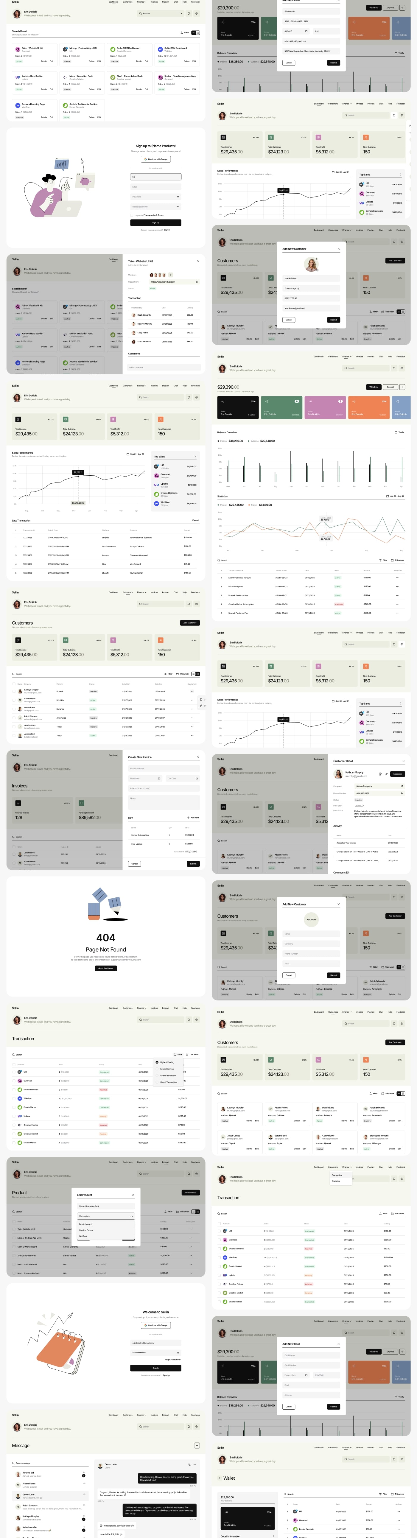
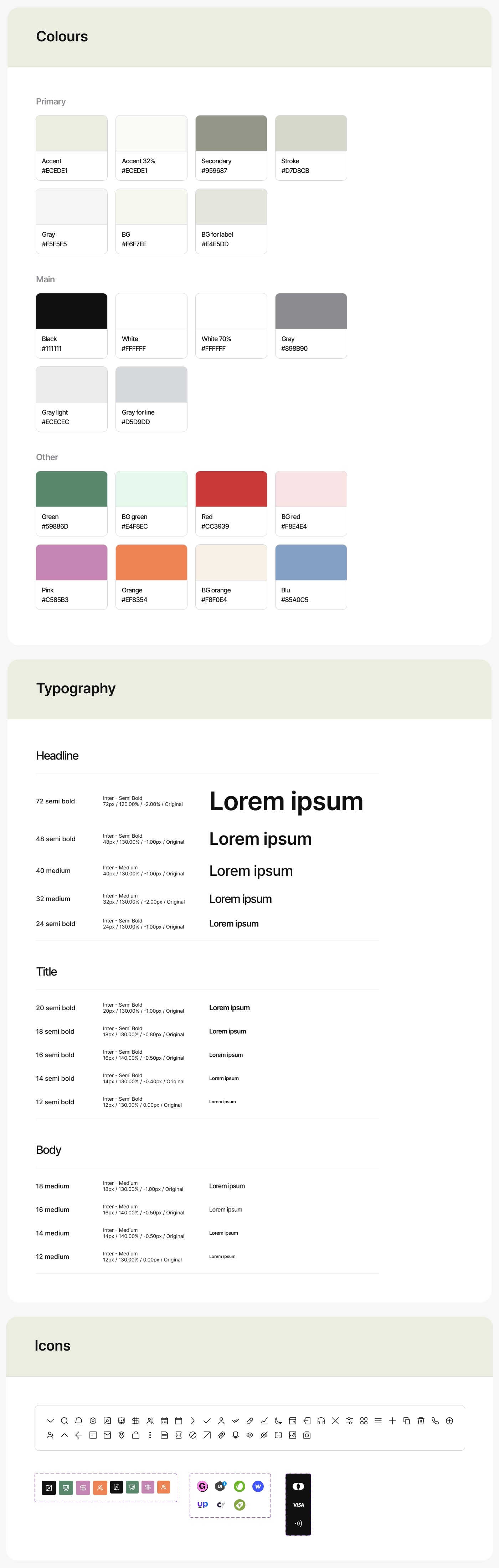
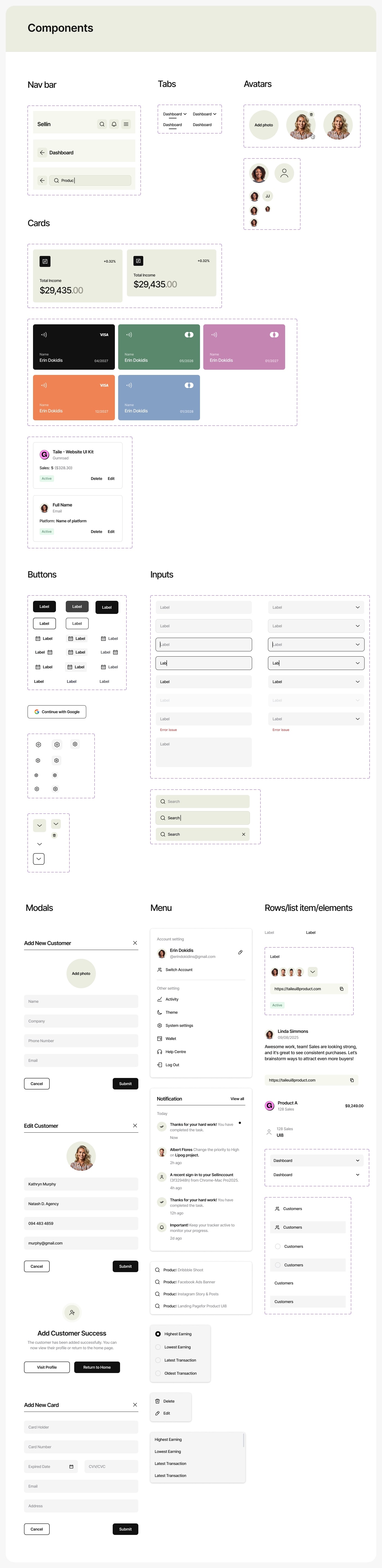
The UX/UI process included research, structural planning, wireframing, low-fidelity prototyping, high-fidelity screen creation, and a full component system prepared for handoff. Throughout these stages, the focus was on building a SaaS dashboard that can support large amounts of commercial data without overwhelming the user. The design system relies on a disciplined grid, a consistent spacing model, and components that deliver predictable layouts across different parts of the platform.

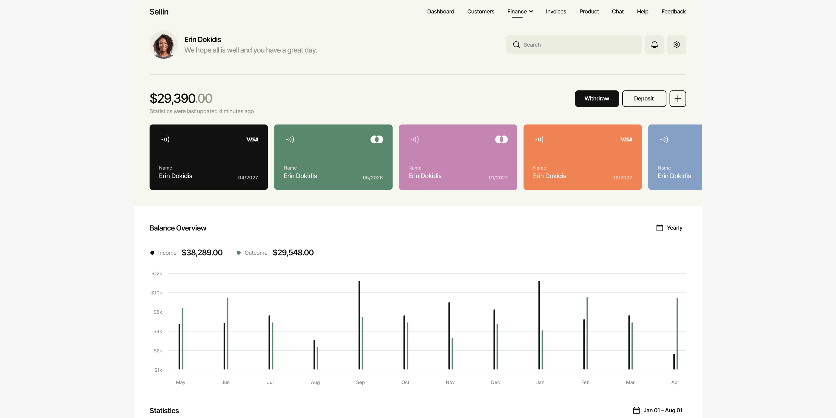
Sellin includes KPI blocks for high-level metrics, revenue and activity charts, category grids, extensive product tables, order lists, inventory indicators, filters, forms, and variant attributes. Dense retail tables were designed using a typographic system optimized for speed of scanning and long-form data rows. The color palette separates metrics, stock states, category distinctions, and product groups without weakening the neutrality required for analytical tools.

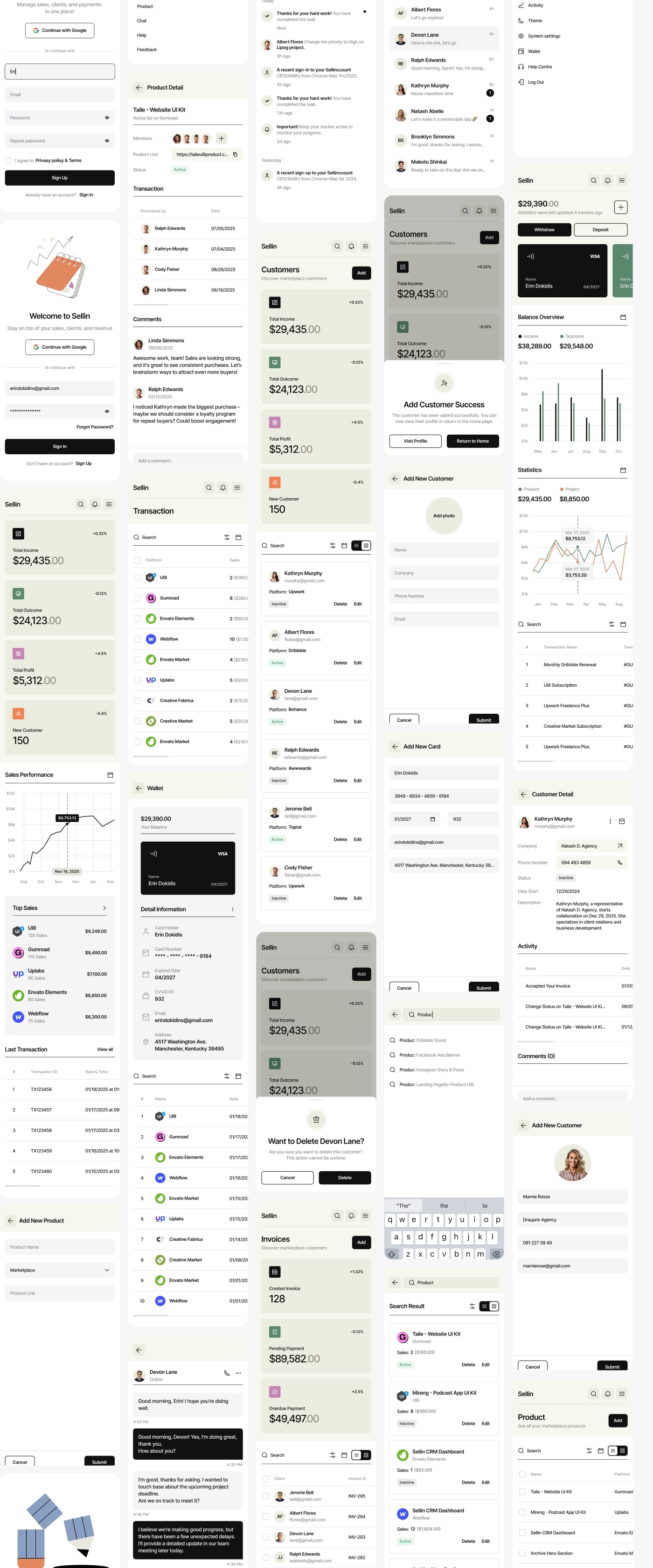
A responsive version ensures that the UX structure remains the same on all devices. KPI cards shift into vertical stacks, charts compress into compact forms, and tables transform into mobile-oriented segments. The goal was to maintain the same information order regardless of screen size. The handoff included tokens, color rules, component states, spacing guides, and a complete UI specification to support clean implementation.

Blog Image

4. Final Outcome and Cross-Industry Application

Sellin provides a stable E-commerce analytics environment that organizes sales data, category behavior, product performance, and SKU-level insights into a structured SaaS dashboard. The reading flow remains consistent: high-level KPIs, timeline analytics, category metrics, product lists, and SKU data. This hierarchy supports real commercial datasets, including large inventories, high transaction volumes, and complex category structures.

The component system is built for scalability and can easily extend into new areas of commerce analytics. Additional modules such as channel-specific dashboards, supplier performance, forecasting tools, or customer segmentation can be added without breaking the UX model. The same principles—structured UX, clear UI design, research-based prototype development, and a strong component library—translate well into other industries. Whether applied to Fintech dashboards, HR analytics, AI monitoring systems, healthcare platforms, or enterprise reporting tools, this approach ensures that dense data remains readable and logically connected.

Sellin demonstrates how a disciplined design process can create a dashboard that stays consistent under the pressure of expanding data, changing product catalogs, and evolving business needs.

Blog Image
Blog Image