Finergy Mobile Finance App — UI Design & Experience

This article explains how we planned and designed the structure of Finergy, a mobile finance app that brings market data, assets, transfers, and account activity into one clear system.

Author Image
Taras Migulko
Art Director
calender-image
November 28, 2025
clock-image
6 min read
Blog Hero  Image

Project Overview

Finergy is a mobile finance app designed to combine spending analytics, investment tracking, and personal budgeting into a clean, structured UI. The goal of the project was to create a finance interface that feels intuitive for daily use while supporting advanced features typically found in fintech, crypto, and SaaS finance platforms. The app’s structure focuses on clear hierarchy, fast data scanning, and a visual system that adapts easily to future financial tools such as crypto assets, automated insights, and portfolio analytics. This case study highlights the UI/UX design approach used to build a scalable mobile finance product.

Blog Image

Problem Definition and Challenges

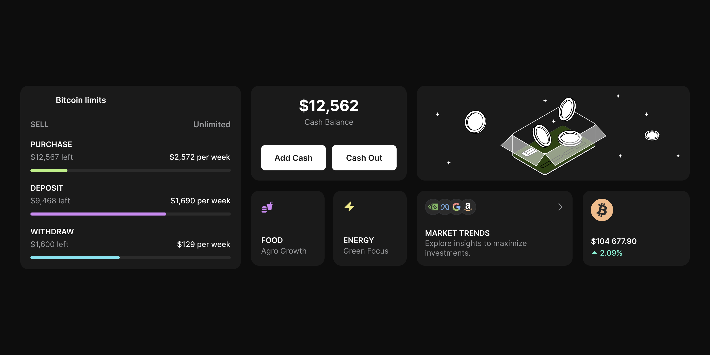
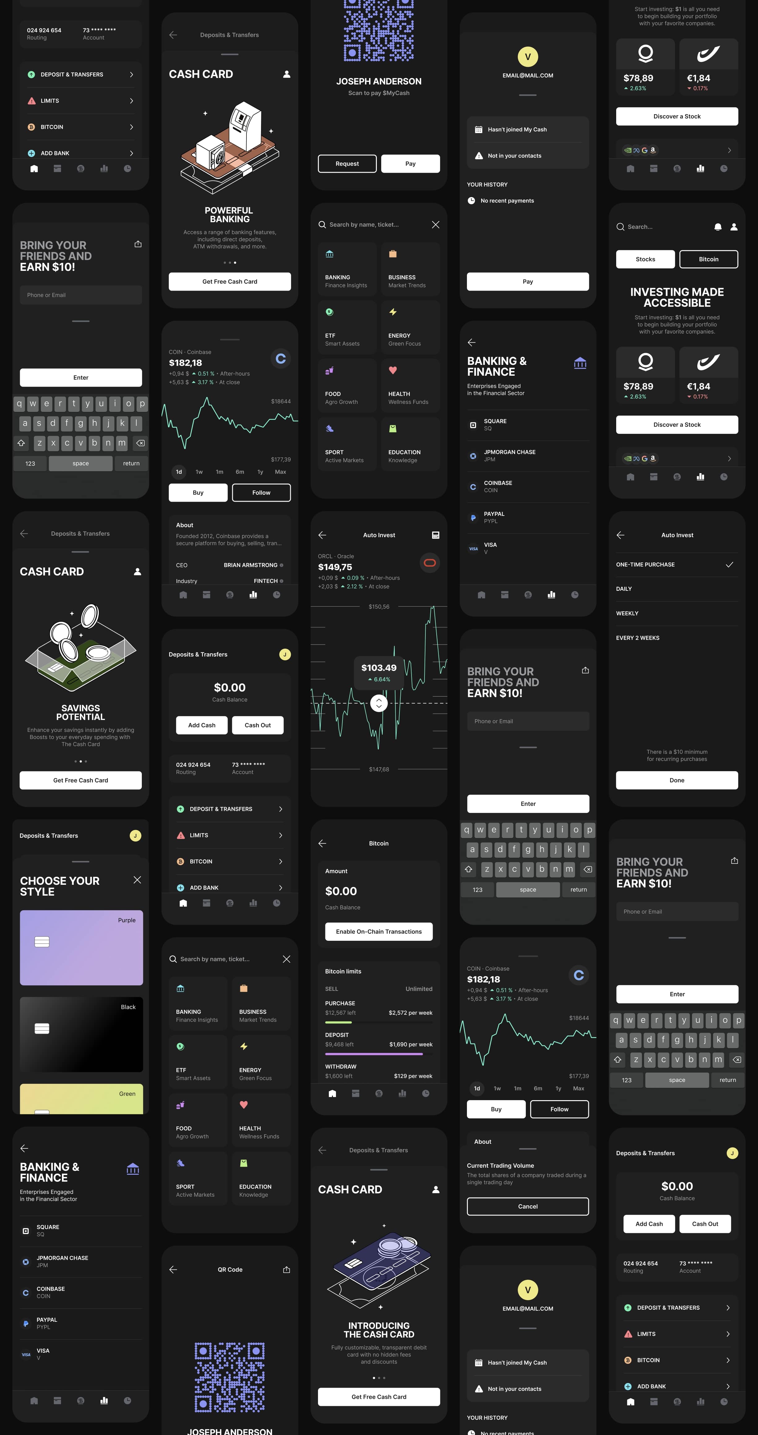
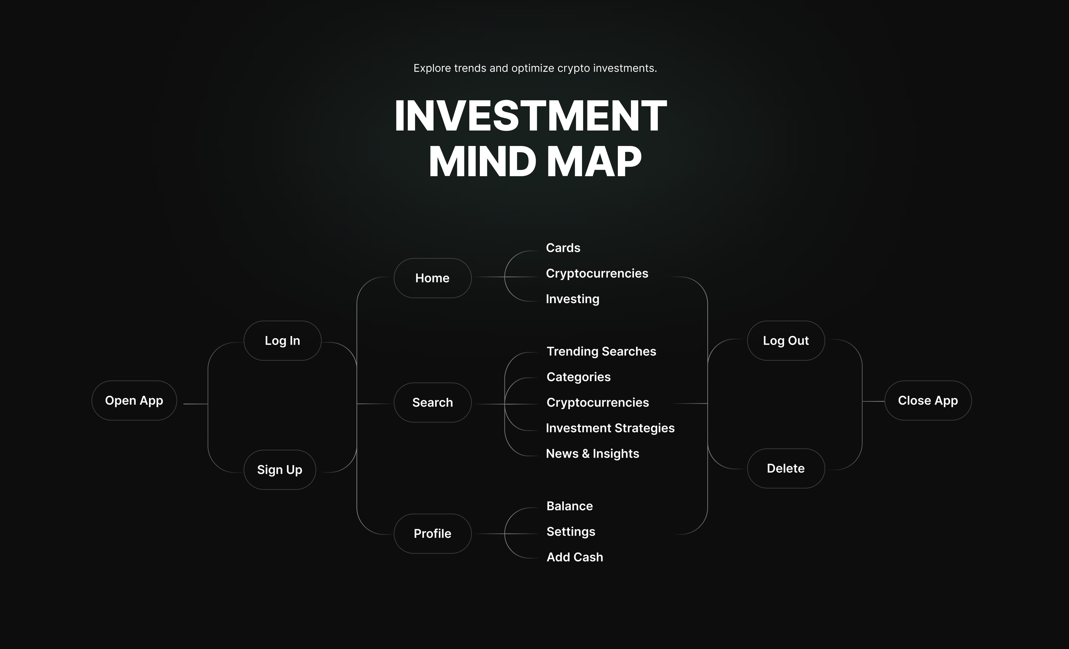
Many fintech and crypto apps suffer from visual overload, inconsistent navigation, and an unclear separation of financial data. Users often struggle to understand balances, transactions, and investment information due to poor hierarchy or unnecessary complexity. The challenge for Finergy was to design a UI/UX system that organizes multiple financial categories—accounts, transactions, savings, investments, and spending insights—into a predictable, controlled experience.

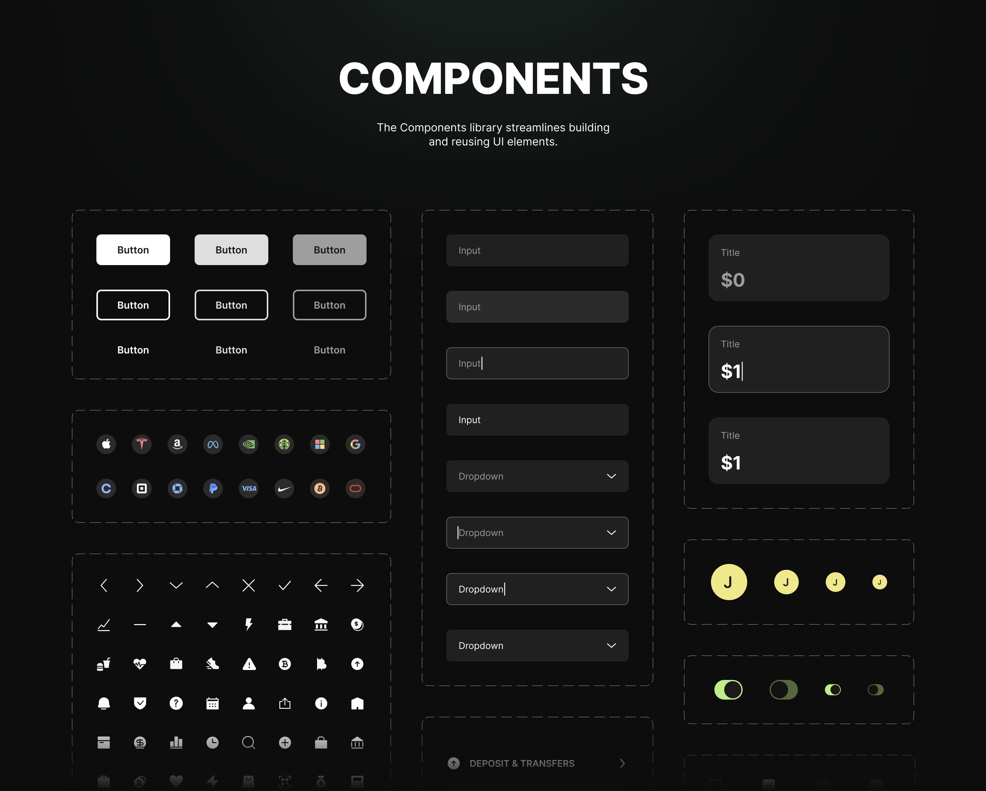
Another requirement was the ability to scale the app into a broader SaaS finance ecosystem. This meant designing flexible components, reusable UI patterns, and a navigation system that could support future features like multi-asset crypto tracking or subscription-based SaaS dashboards.

“A well-designed finance app isn’t just a collection of screens; it’s a clear system where every flow, interaction, and piece of data works together to help users understand their finances and move confidently through the product.”

UX/UI Process

The design process started with user flow mapping and restructuring navigation around the primary financial actions. We explored dashboard variations, graph layouts, and data-density adjustments to find a balance between detail and clarity. Wireframes defined the core structure, and user-task scenarios helped refine the placement of analytics, interactions, and micro-components.

After validating the information architecture, we created a component-based system with consistent rules for cards, charts, inputs, buttons, and data views. This allowed Finergy to scale like a SaaS platform while maintaining a unified visual identity. The UI design approach focused on clarity, contrast, system-wide typography rules, and patterns commonly used in fintech and crypto products.

Blog Image

Final Design Decisions and Outcome

The final interface supports a clean and reliable finance experience. Key financial data is grouped logically, interactions stay stable across all screens, and the dark theme supports long-term use—important for fintech and investment-heavy apps. The global style guide and component library ensure scalability for upcoming features and expansion into crypto markets or SaaS-based financial tools.

Finergy delivers a structured, predictable UI that feels trustworthy and easy to use. This case demonstrates how UX strategy, component-driven design, and scalable SaaS thinking can create a finance app that works for both traditional users and those in fintech and crypto ecosystems.

Blog Image
Blog Image