Spark — EdTech Analytics SaaS Dashboard

This case study breaks down how MITACORE designed an EdTech SaaS analytics dashboard from the ground up — focusing on UX structure, UI clarity, research-driven decisions, and a component system that scales with complex learning data. The goal wasn’t decoration, but a functional model for understanding student activity, lesson performance, and course behavior across devices.

Author Image
Taras Migulko
Art Director
calender-image
November 28, 2025
clock-image
7 min read
Blog Hero  Image

1. Platform Context

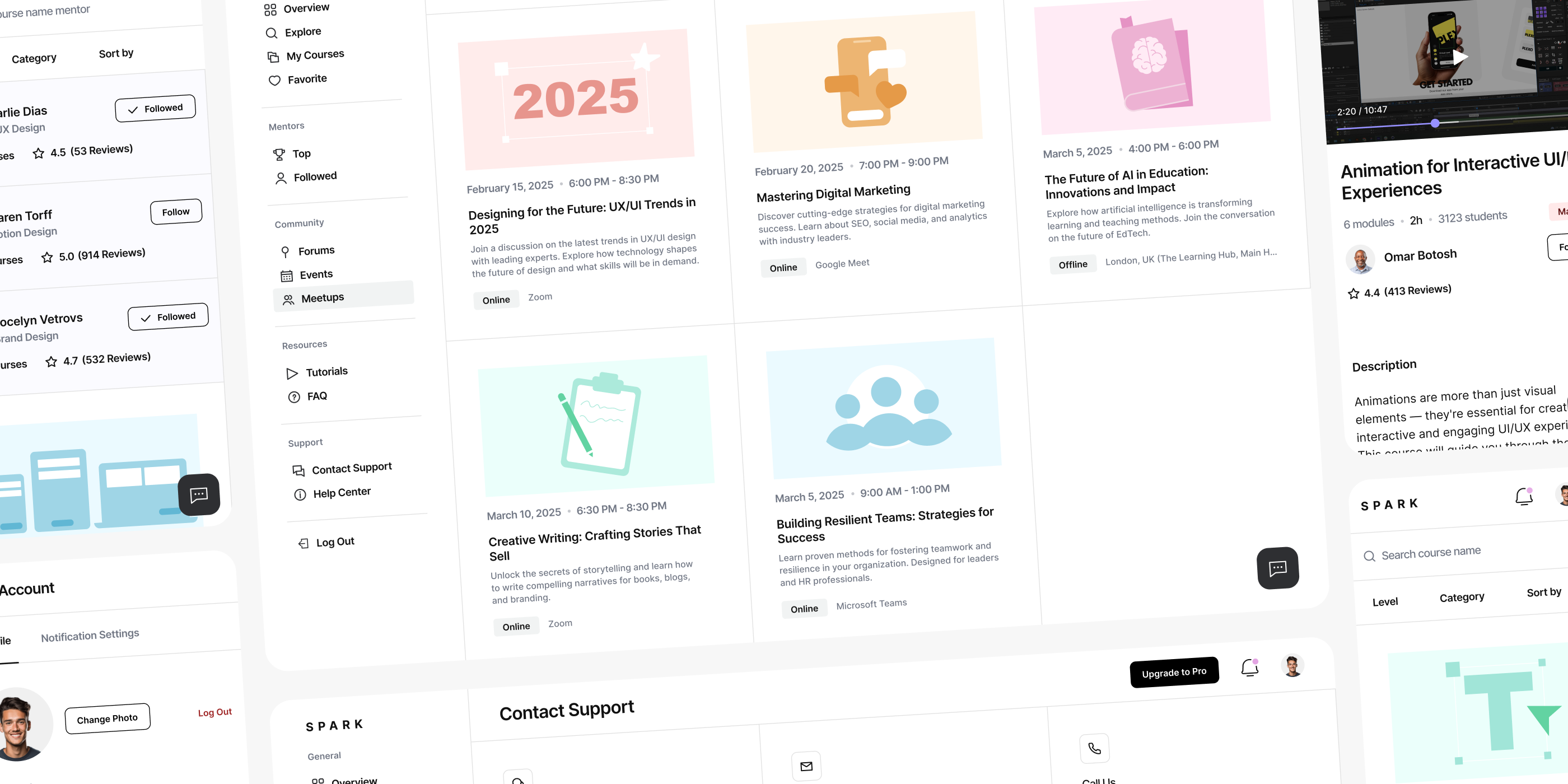
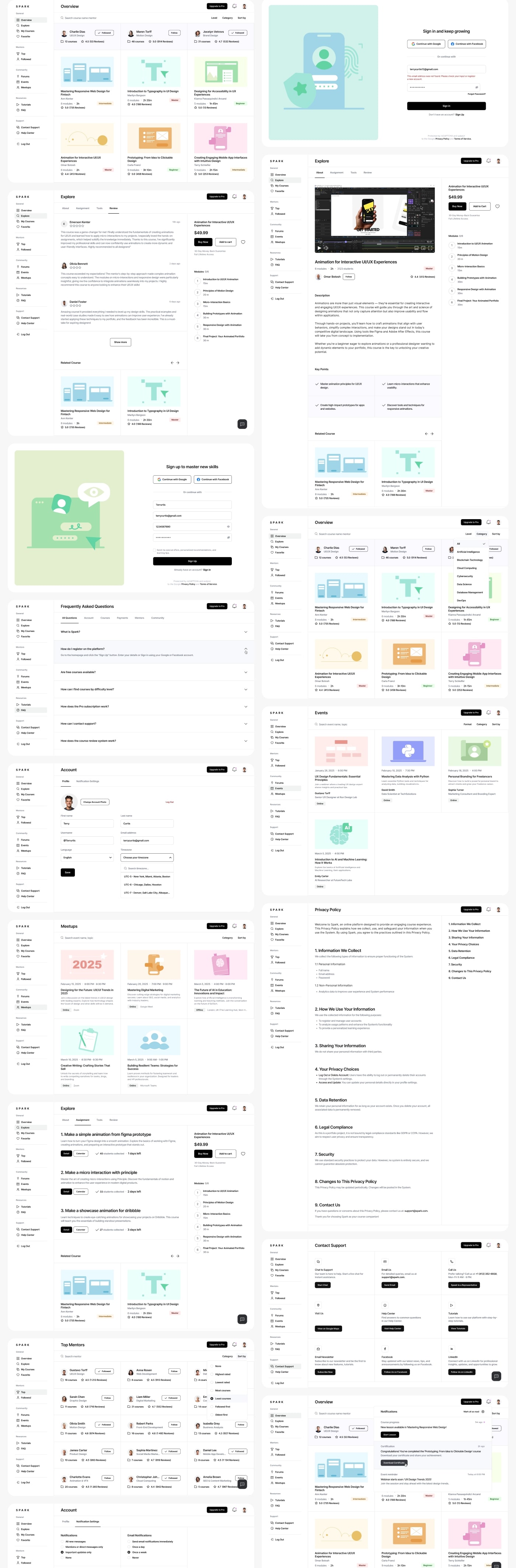
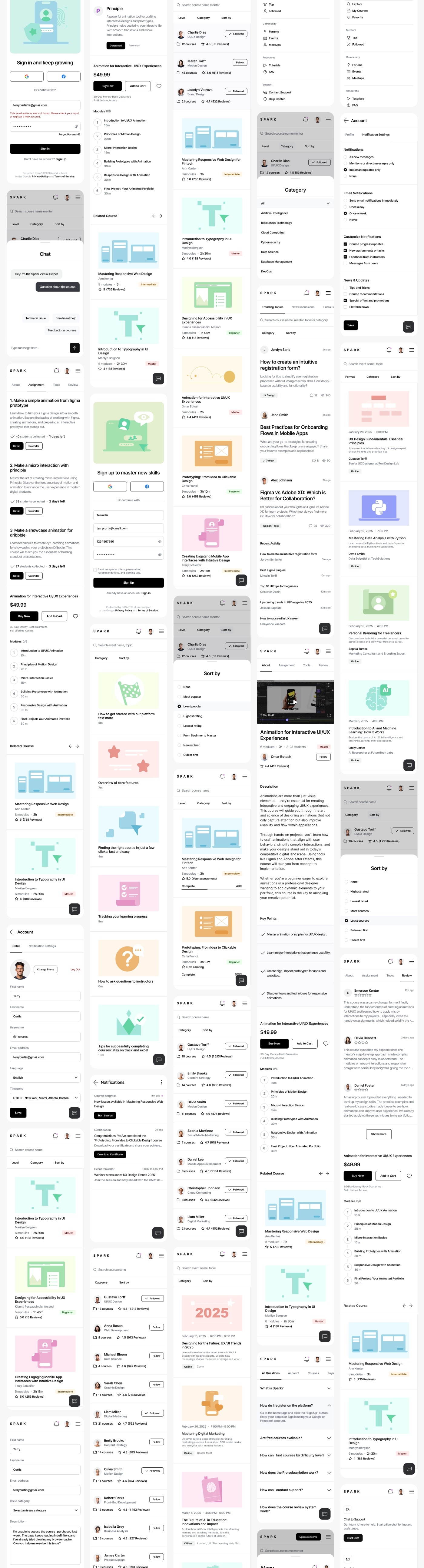
MITACORE developed the UX and UI for an EdTech SaaS platform built to track student activity and translate it into a structured analytics dashboard. The goal of the project was not to “decorate” the interface but to construct a system that can hold large volumes of learning data: completed lessons, daily engagement, retention patterns, watch time, course progress, and module-level performance.

From the beginning, the work revolved around strict UX logic. Information had to read from top to bottom, follow a stable rhythm, and remain free of visual noise. Instructors use dashboards to make decisions, not to decipher scattered UI elements, so the interface was engineered around real usage behavior.

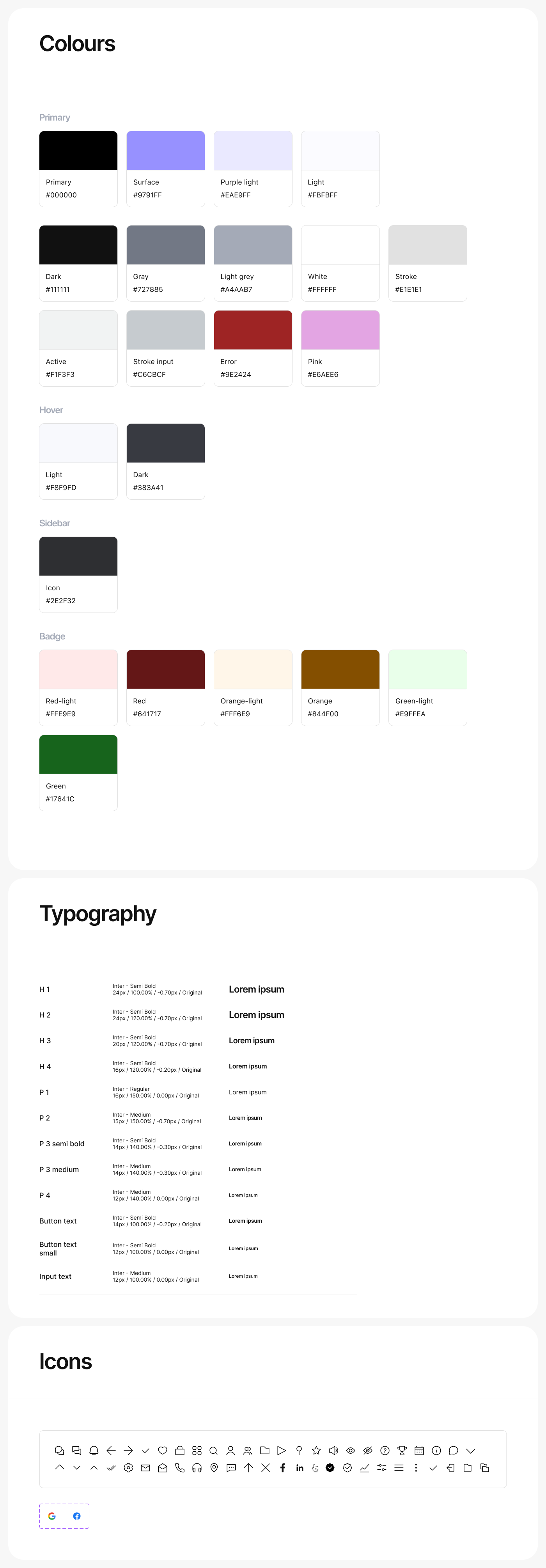
The UI was treated as a tool, not a visual theme. Spacing, density, typography, and color accents support analytical tasks rather than cosmetic preferences. Throughout the process, we relied on continuous research, reviewing existing EdTech SaaS solutions and identifying common failures in element hierarchy, broken user flows, and dashboards that present numbers without context. This became the basis for a system that remains readable at scale, both on wide desktop layouts and compact responsive views.

Blog Image

2. Research Foundation and Data-Driven Structure

During research, MITACORE analyzed a broad set of SaaS learning platforms, including LMS systems, creator dashboards, and content-performance tools. Most followed the same problematic pattern: data wasn’t aligned with a clear user flow. Charts, tables, lesson lists, and engagement blocks existed independently, forcing instructors to jump between unrelated fragments of the interface.

After synthesizing the research, we built the first prototype. It wasn’t a visual UI mockup but a structural model designed to test how information moves: course overview → activity distribution → course structure → module details. The prototype clarified how many steps users need to reach the metrics they care about and exposed redundant layers of navigation.

Research also included observing student behavior—points of drop-off, lesson friction, fast-moving segments, and where engagement tends to plateau. These findings shaped the dashboard’s final architecture: high-level trends at the top, contextual breakdowns below, and detailed lesson-level data at the bottom. The goal was to eliminate hunting for metrics and create a continuous, predictable flow of interpretation.

“A dashboard only works when data follows a clear path. Structure is not decoration — it’s how decisions become possible.”

3. UX/UI Process, Prototyping and System Architecture

The UX and UI process followed a staged workflow: scenarios → low-fidelity prototype → high-fidelity prototype → final interface design. Each step focused on verifying interaction logic, component behavior, and data readability. The prototypes allowed us to stress-test how the dashboard behaves with growing data sets and how the system adapts across responsive breakpoints.

UX decisions centered on consistency across devices. Responsive design was treated not as rearranging blocks but as preserving the logical sequence of reading. This required a component system where each element—cards, charts, tables, filters, lesson lists—has a clear, fixed function and predictable behavior.

The UI phase included grid definition, spacing rules, color usage for metrics, non-decorative iconography, and typography optimized for dense information. Once the UI was finalized, MITACORE delivered a complete handoff package: design tokens, spacing rules, component states, adaptation logic, behavior diagrams, and responsive patterns. The handoff ensured that development teams could implement the system without interpreting or guessing intent, which is essential for large SaaS products.

Blog Image

4. Final Outcome and Cross-Industry Application

The final dashboard operates as a stable UX system where UI structure serves analytical clarity rather than visual novelty. Color accents mark essential data, typography maintains legibility across contexts, and components remain functional even as content expands.

The component library allows the platform to scale—new metrics, new modules, new charts, new analytics layers—without breaking the underlying UX flow. The method we applied here can be transferred to other SaaS domains beyond EdTech. MITACORE’s structure works in Fintech, HR analytics, AI dashboards, healthcare platforms, and CRM environments. Our approach relies on consistent UX patterns, resilient UI systems, research-driven structure, a clear prototype cycle, and a disciplined handoff that gives development teams clarity rather than overhead.

This project demonstrates that dashboards remain readable only when UX structure is strict, UI logic is consistent, and components follow explicit rules. That principle drives how MITACORE builds SaaS products in any industry: minimal noise, clear hierarchy, predictable flows, and stable interaction systems designed for real data.

Blog Image
Blog Image